Homepage Design Tips That Drive Conversions in 2025
What your homepage says in three seconds could make or break your business.
Visitors don’t read your homepage — they scan it. In just seconds, they’ve already decided whether to stay or leave. A poor design will cost you conversions, but a homepage that clearly guides visitors and focuses on user experience? That’ll help you secure more leads and sales.
In 2025, homepage design is all about clarity, trust, and simplicity. This creates a seamless user experience that encourages meaningful actions. If your design is messy, your calls-to-action (CTAs) get lost, and visitors find it hard to navigate, you risk losing potential customers.
Keep reading, and we’ll walk you through proven homepage design tips for 2025 inspired by industry leaders. You’ll learn how to enhance your homepage, eliminate common pain points, and lead visitors to convert quicker than ever.
Ready to transform your homepage into a high-converting machine? Let’s dive in.
Design for How People Really Browse
Great homepage design isn’t about cramming in every feature. It’s about showing the right things at the right moment. Your homepage should act as a signpost, guiding visitors where they need to go in as few clicks as possible.
- Keep the layout clean, with a clear visual hierarchy.
- Use a single, focused call to action (CTA) above the fold.
- Think mobile-first (because most users are already there).
Tip: Avoid homepage carousels. They’re outdated, slow down your site, and rarely convert (trust us)!
Need help simplifying your user journey? Our web UX team can help you build a smarter, faster homepage that puts users first.
Prioritise Speed & Mobile UX
According to Google, users are 32% more likely to bounce if your page takes longer than 3 seconds to load. And in 2025, with mobile-first indexing in full force, you can’t afford to ignore how your homepage performs on phones and tablets.
Here’s What We Optimise for Every Site We Build
- Lightweight image formats (like WebP) for faster load times.
- Responsive layouts with intuitive, mobile-friendly menus.
- Clickable CTA buttons with reasonable spacing for easy interaction on any device.
- No frustrating popups, especially on mobile, to keep users engaged.
Want to see how your site stacks up? Request a free performance audit from our SEO team.
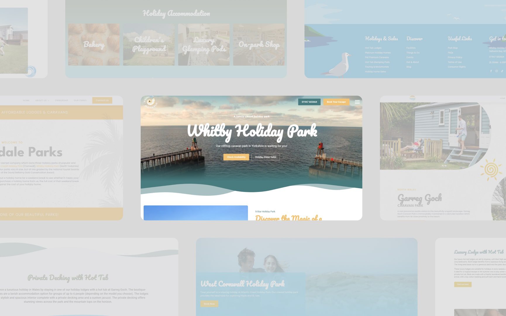
Use Visuals That Build Trust (Not Just Attention)
High-quality visuals still make a homepage welcoming and engaging, but random stock photos won’t do the trick. Today’s users expect visuals that inform, reassure, and show personality. So, grab their attention by including imagery that reflects your audience’s lifestyle, product context, or values.
Here’s How to Use Visuals Effectively:
- Team photos humanise your brand and show the people behind the business.
- Real-life client projects or testimonials are instrumental in helping build credibility.
- Award wins, certifications, or review scores to reinforce trustworthiness.
On this note, it’s worth thinking of your homepage as a shopfront. If it’s cluttered, impersonal, or outdated, people will not engage with it.
Not sure where to start? Our media production team can help create bespoke visuals that capture your brand in action.
Guide Users with Strong, Purposeful Calls to Action
Every homepage should do one thing well: convert. And that all begins with clear, compelling calls to action (CTAs). So, whether you’re looking to generate leads, encourage sign-ups, or prompt purchases, your CTAs need to be loud and clear. For starters, avoid vague phrases like “Get Started” or “Click Here.”
Instead, Use Benefit-Driven Copy
- “Start your free trial”
- “See pricing & plans”
- “Book your discovery call”
And don’t bury your CTA at the bottom. Position them where they’ll be noticed: above the fold, then repeat them mid-page, and reinforce them at the end. Think of your CTA as a guide rope leading visitors through your content.
Bonus tip: Use colour contrast, whitespace, and consistent language to make your CTAs *pop*.
Build Trust Early with Social Proof
Visitors are naturally sceptical. They want to know: “Has this worked for people like me?”
That’s where social proof comes in. Reviews, client logos, awards, or case studies on your homepage can dramatically boost conversion rates. They’re particularly effective for first-time visitors!
Here’s How to Implement Social Proof
- A scrolling carousel of testimonials is prominently displayed mid-page.
- A Trustpilot widget or Google review badge to boost your credibility.
- Feature logos of recognisable clients, especially for B2B businesses.
- Utilise a “Featured in” strip showcasing any media mentions or awards.
Pro Tip: Don’t wait until your About page to showcase your credibility. Frontload it on your homepage to increase trust from the moment visitors arrive.
Want to learn more? Visit our latest web design insights for more on integrating social proof effectively.
Use Analytics to Shape Your Homepage Over Time
Your homepage should never be a static entity. The best-performing websites are constantly evolving based on user behaviour and data insights. Analytics tools can help you identify where users are clicking, what they’re ignoring, and where they’re dropping off. This insight enables you to refine and A/B test your homepage with purpose.
What to Monitor
- Bounce rates on desktop and mobile: High bounce rates could indicate a need for faster load times or clearer CTAs.
- Heatmaps show dead zones where users don’t interact.
- Scroll depth reports: Are people even seeing your CTAs?
- Entry and exit pages in Google Analytics: Which pages are users landing on, and where are they leaving?
At b4b, we don’t guess, we measure. Our in-house team combines analytics with real UX feedback to create sites that continue to resonate with your audience.
Make Your Homepage a Conversion Powerhouse in 2025
Your homepage isn’t just a digital brochure; it’s your first chance to turn visitors into loyal customers. In 2025, a high-converting homepage is all about clarity, trust, and user-focused design.
Whether you’re launching a new brand or refreshing an existing site, your homepage sets the tone. It must speak to your target audience in a way that feels approachable, professional, and easy to navigate.
Here’s What's Worth Taking Away from the Above
- Keep your homepage simple, direct, and easy to navigate.
- Ensure your homepage functions across all devices, especially mobiles.
- Testimonials, certifications, and security badges build credibility.
- Fast load times are essential for keeping visitors engaged.
- Monitor performance and make data-driven improvements.
With these strategies in place, your homepage will look great, perform better, and potentially experience a drive in more leads and conversions. So, are you ready to create a homepage that actually converts?
Call us on 01202 684400 or book a free consultation with our award-winning team, and we’ll help optimise your site to drive better results.